3.0. Core application of data analytics
3.1. Financial Accounting And Reporting
3.1.2. Analyse financial statements using ratios, common size statements, trend and cross-sectional analysis, graphs and charts
Graphs and Charts:
In the realm of financial statement analysis, graphs and charts emerge as unsung heroes, transforming numerical data into visual narratives. These visual tools provide clarity, reveal trends, facilitate comparisons, encourage data exploration, and enhance communication. For instance, line charts unveil growth patterns, bar charts aid in performance evaluation, and pie charts dissect expense compositions. Whether assessing risk-return profiles or tracking stock prices, the visual power of graphs and charts elevates financial analysis to new heights, offering a compelling way to decode complex financial data.
Releted Context:
-
3.1.1. Prepare financial statements; statement of profit or loss, statement of financial position and statement of cash flow for companies and groups
3.1.1.1. Unlocking Profit Potential: How Data-Driven Analysis Transforms P&L Elements for Maximum Earnings and Cost Efficiency 3.1.1.2. The Impact of Data Analytics on the Statement of Financial Position -
3.1.1.3. Unlocking Financial Insights: How Data Analytics Enhances Cash Flow Interpretation for Stakeholders
3.1.2. Analyse financial statements using ratios, common size statements , trend-analysis and cross-sectional analysis, graphs and charts 3.1.3. Prepare forecast financial statements under specified assumptions
3.1.4 . Data visualization and dash boards for reporting
KEY TAKEAWAYS
- Graphs and charts, such as bar charts, pie charts, and scatter plots, can be used to visually represent financial data.
- Visualizations make it easier to identify and communicate trends, comparisons, and outliers in financial statements.
Visualizing Financial Insights: How Graphs and Charts Enhance Financial Statement Analysis
Introduction:
Graphs and charts are indispensable tools in the realm of data analytics, offering a visual means to analyze complex financial data effectively. When applied to financial statements, they provide a visual narrative that goes beyond mere numbers. In this article, we'll delve into the use of graphs and charts as data analytics tools for enhancing financial statement analysis, accompanied by comprehensive examples.
Why Use Graphs and Charts in Financial Statement Analysis:
- Clarity and Communication: Graphs and charts present financial data in a clear and concise manner, making it easier for stakeholders to understand complex financial information.
- Trend Identification: Visual representations allow for the rapid identification of trends and patterns within financial data, which may not be immediately evident when examining numerical tables.
- Comparative Analysis: Graphs and charts facilitate the comparison of financial metrics across different time periods, companies, or industries, aiding in benchmarking and performance evaluation.
- Data Exploration: They encourage exploration of financial data by highlighting outliers, anomalies, and correlations, enabling deeper insights and informed decision-making.
- Impactful Presentations: For financial analysts, charts and graphs are powerful tools for presenting findings and recommendations to clients, colleagues, or management in a visually compelling manner.
Examples of Using Graphs and Charts in Financial Statement Analysis:
Example 1: Trend Analysis with Line Charts
➧ Scenario: You are studying the performance of a particular stock on the exchange over the last 12 months. Through a line chart representation of its annual stock prices, you observe that it has been fluctuating in a downward trajectory.
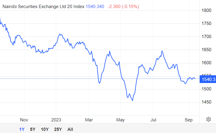
Trend Analysis with Line Charts.
Assuming you have two columns in your Excel sheet: one for the months (A2 to A13) and another for the stock prices (B2 to B13), you can enter the following data:
| Month | Price |
|---|---|
| January | 1700 |
| February | 1600 |
| March | 1530 |
| ....and so on | |
- Select the data in both columns (A2 to B13).
- Go to the "Insert" tab on the Excel ribbon.
- In the "Charts" group, select "Line" and choose the "Line with Markers" option (or any other line chart type you prefer). This will insert a line chart onto your worksheet.
- You should now see a basic line chart on your Excel worksheet. You can further customize it by adding labels, titles, and legends as needed.
- To add a title to your chart, click on the chart title and edit it.
- To add axis labels, right-click on the chart, select "Add Chart Element," and choose "Axis Titles."
- To add a legend (if needed), right-click on the chart, select "Add Chart Element," and choose "Legend."
- You can also format the chart's appearance, such as line color, marker style, and more, by selecting the chart elements and using the "Chart Tools" options in the Excel ribbon.
- Finally, you can move the chart to a new sheet or position it on the existing worksheet as desired.
keyboard_arrow_up keyboard_arrow_down
➢ Benefit: The line chart highlights a noticeable pattern of downward movement, allowing you to analyze and potentially predict future price declines or assess the influence of external factors on this negative trend.
Example 2: Comparative Analysis with Bar Charts
➧Scenario: You are comparing the profitability of three companies within the same industry. Using a bar chart, you visualize and compare the net profit margins of Company A, Company B, and Company C.
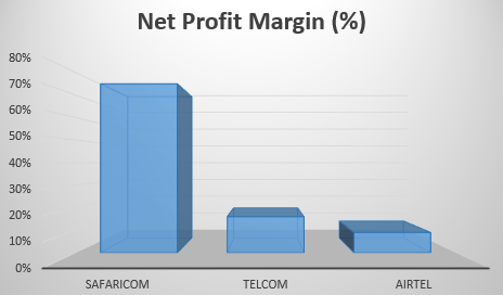
Comparative Analysis with Bar Charts
Assuming you have a dataset like this:
| Company | Net Profit Margin (%) |
|---|---|
| Company A | 75 |
| Company B | 16 |
| Company C | 9 |
Follow these steps to create a bar chart:
- Enter your data into an Excel spreadsheet, with the company names in one column and their respective net profit margins in another column.
- Highlight the company names and their net profit margins. This is the data you want to include in your bar chart.
- Go to the "Insert" tab in Excel.
- Click on "Bar Chart" or "Column Chart."
- A bar chart will be inserted into your worksheet. You can now make some customizations:
- To change the chart title, click on the chart title and edit it. For this example, you might use a title like "Net Profit Margin Comparison - Companies A, B, and C."
- You can also right-click on different elements of the chart (bars, axes, legends, etc.) to format and customize them as needed.
- If a legend isn't automatically added, you can add one by right-clicking on the chart, selecting "Add Chart Element," and choosing "Legend."
- To add data labels (the percentage values on top of each bar), right-click on the bars, choose "Add Data Labels."
- Customize the chart further by right-clicking on various elements, such as axes, gridlines, and bars, and selecting "Format" to change colors, fonts, and other visual aspects.
- Explore different chart styles by clicking on the chart and going to the "Chart Design" tab. Choose a style that best suits your preferences.
- Save your Excel file with the chart, and you can also copy and paste the chart into other documents or presentations.
This bar chart will effectively visualize and compare the net profit margins of Company A, Company B, and Company C, allowing viewers to see at a glance how they compare within the same industry.
keyboard_arrow_up keyboard_arrow_down
➢Benefit: The bar chart provides a visual snapshot of how each company's profitability compares to its peers, aiding in performance evaluation and investment decisions.
Example 3: Pie Chart for Expense Breakdown
➧Scenario: You want to illustrate the composition of a company's expenses. A pie chart shows the percentage breakdown of expenses into categories like operating expenses, interest payments, and taxes.
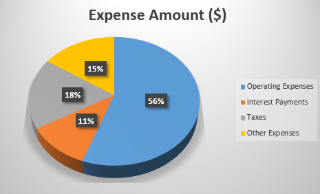
Pie Chart for Expense Breakdown
Creating a pie chart to illustrate the composition of a company's expenses is a great way to visualize the percentage breakdown of various expense categories. Here's an example of how to create a pie chart in Excel to represent the composition of a company's expenses:
Assume you have the following expense data:
| Expense Category | Expense Amount($) |
|---|---|
| Operating Expenses | 25,000 |
| Interest Payments | 5,000 |
| Taxes | 8,000 |
| Other Expenses | 7,000 |
- Prepare Your Data:
- Enter the expense categories and their respective amounts in an Excel spreadsheet.
- Select Data for Chart:
- Highlight the expense categories and their corresponding expense amounts. This is the data you want to use for the pie chart.
- Insert Pie Chart:
- Go to the "Insert" tab in Excel.
- Click on "Pie Chart" and select a 2D or 3D pie chart style, whichever you prefer.
- Create the Chart:
- A pie chart will be inserted into your worksheet. You can customize it as follows:
- To change the chart title, click on the chart title and edit it. You can use a title like "Expense Composition."
- You can also right-click on different elements of the chart (slices, legend, etc.) to format and customize them as needed.
- Legend:
- If a legend isn't automatically added, you can add one by right-clicking on the chart, selecting "Add Chart Element," and choosing "Legend."
- Explode a Slice (Optional):
- If you want to emphasize a particular expense category, you can "explode" or pull out a slice of the pie. Click on the slice you want to explode, and then drag it away from the center of the pie chart.
- Formatting:
- Customize the chart further by right-clicking on various elements, such as labels and the chart area, to change colors, fonts, and other visual aspects.
- Save and Share:
- Save your Excel file with the chart, and you can also copy and paste the chart into other documents or presentations.
This pie chart effectively illustrates the composition of the company's expenses, showing the percentage breakdown of each expense category relative to the total expenses. Viewers can easily see how expenses are distributed among operating expenses, interest payments, taxes, and other expenses.
keyboard_arrow_up keyboard_arrow_down
➢Benefit: The pie chart offers a quick overview of where a company's expenses are concentrated, helping identify areas for cost-cutting or optimization.
Example 4: Scatter Plot for Risk Assessment
➧ Scenario: You are evaluating the risk-return profile of a portfolio of stocks. A scatter plot can depict the relationship between the portfolio's returns and its volatility (standard deviation).
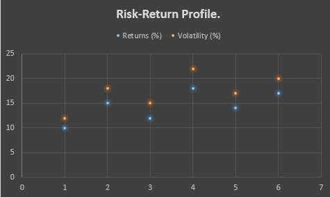
Trend Analysis with Line Charts.
Creating a scatter plot to depict the relationship between a portfolio's returns and its volatility (standard deviation) is a common way to evaluate the risk-return profile of an investment portfolio.
Here's how you can create such a scatter plot in Excel:
Assuming you have a dataset with portfolio returns and their corresponding standard deviations:
| Portfolio | Returns (%) | Volatility (%) |
|---|---|---|
| Portfolio A | 10 | 12 |
| Portfolio B | 15 | 18 |
| Portfolio C | 12 | 15 |
| ... and so on | ... and so on | ... and so on |
Here are the steps to create a scatter plot:
- Prepare Your Data:
- Enter the portfolio names, their returns, and their corresponding standard deviations into an Excel spreadsheet.
- Select Data for Chart:
- Highlight the returns and standard deviations columns. This is the data you want to include in your scatter plot.
- Insert Scatter Plot:
- Go to the "Insert" tab in Excel.
- Click on "Scatter" and select a scatter plot style. Typically, you'll want a scatter plot with data points and no lines connecting them.
- Create the Chart:
- A scatter plot will be inserted into your worksheet. You can customize it as follows:
- To add a chart title, click on the chart title and edit it. You can use a title like "Risk-Return Profile."
- You can also right-click on different elements of the chart (data points, axes, legend, etc.) to format and customize them as needed.
- Axis Labels:
- Make sure to label the X-axis as "Volatility (%)" and the Y-axis as "Returns (%)." You can do this by clicking on the respective axis labels and editing them.
- Trendline (Optional):
- If you want to add a trendline to visualize the relationship between returns and volatility, right-click on a data series point, select "Add Trendline," and choose the appropriate trendline type (linear, logarithmic, polynomial, etc.).
- Formatting:
- Customize the chart further by right-clicking on various elements and selecting "Format" to change colors, markers, and other visual aspects.
- Save and Share:
- Save your Excel file with the scatter plot, and you can also copy and paste the chart into other documents or presentations.
This scatter plot will visually depict the risk-return profile of your investment portfolio, helping you identify any patterns or trends in how returns relate to volatility. It's a valuable tool for portfolio analysis and decision-making.
keyboard_arrow_up keyboard_arrow_down
➢ Benefit: The scatter plot helps assess the trade-off between risk and return, guiding portfolio diversification decisions.
Example 5: Candlestick Chart for Stock Price Analysis
➧ Scenario: You're analyzing the historical stock prices of a company. Candlestick charts are used to visualize daily price movements, including open, close, high, and low prices.
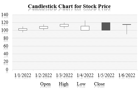
Candlestick Chart for Stock Price Analysis.
Here's a step-by-step guide on how to create a basic candlestick chart in Excel:
Assuming you have a dataset like this:
| Date | Open | High | Low | Close |
|---|---|---|---|---|
| 1/1/2022 | 100 | 110 | 95 | 105 |
| 1/2/2022 | 105 | 115 | 100 | 110 |
| 1/3/2022 | 110 | 120 | 105 | 115 |
| 1/4/2022 | 100 | 125 | 100 | 111 |
| 1/5/2022 | 120 | 115 | 110 | 100 |
| 1/6/2022 | 115 | 90 | 105 | 115 |
Follow these steps:
- Select Your Data:
- Highlight the data including the headers (Date, Open, High, Low, Close).
- Insert a Candlestick Chart:
- Go to the "Insert" tab in Excel's ribbon and select "Recommended Charts." You should see "Candlestick" as one of the recommended chart types. Click on it and press "OK."
- Format the Chart:
- Your candlestick chart should now be created. However, it might need some formatting for better readability. Here are a few tips:
- Add data labels to the data points to display the values (Open, High, Low, Close) on the chart. Right-click on the data points, select "Add Data Labels."
- Adjust the axis labels and titles as needed.
- You can also change the colors and styles of the candlesticks and data labels to match your preference.
- Analyze the Chart:
- Your candlestick chart is now ready for analysis. Each candlestick represents a day's price movement. The body of the candlestick represents the opening and closing prices, while the lines (wicks) above and below the body represent the high and low prices.
By following these steps, you can create a candlestick chart in Excel to visualize historical stock prices. This chart can help you identify trends and patterns in the stock's price movements, which can be valuable for technical analysis.
➢ Benefit: Candlestick charts are vital for technical analysis in stock trading, enabling traders to identify buying and selling signals based on price patterns.
keyboard_arrow_up keyboard_arrow_down
Graphs and charts are invaluable tools in financial statement analysis. They offer clarity, facilitate trend identification, enable comparative analysis, encourage data exploration, and enhance the communication of financial insights. In various scenarios, from trend analysis to risk assessment, the power of visual representation through graphs and charts transforms complex financial data into actionable information.
Financial Accounting And Reporting
Table of contents
Syllabus
-
1.0
Introduction to Excel
- Microsoft excel key features
- Spreadsheet Interface
- Excel Formulas and Functions
- Data Analysis Tools
- keyboard shortcuts in Excel
- Conducting data analysis using data tables, pivot tables and other common functions
- Improving Financial Models with Advanced Formulas and Functions
-
2.0
Introduction to data analytics
-
3.0
Core application of data analytics
- Financial Accounting And Reporting
- Statement of Profit or Loss
- Statement of Financial Position
- Statement of Cash Flows
- Common Size Financial Statement
- Cross-Sectional Analysis
- Trend Analysis
- Analyse financial statements using ratios
- Graphs and Chats
- Prepare forecast financial statements under specified assumptions
- Carry out sensitivity analysis and scenario analysis on the forecast financial statements
- Data visualization and dash boards for reporting
- Financial Management
- Time value of money analysis for different types of cash flows
- Loan amortization schedules
- Project evaluation techniques using net present value - (NPV), internal rate of return (IRR)
- Carry out sensitivity analysis and scenario analysis in project evaluation
- Data visualisation and dashboards in financial management projects
-
4.0
Application of data analytics in specialised areas
- Management accounting
- Estimate cost of products (goods and services) using high-low and regression analysis method
- Estimate price, revenue and profit margins
- Carry out break-even analysis
- Budget preparation and analysis (including variances)
- Carry out sensitivity analysis and scenario analysis and prepare flexible budgets
- Auditing
- Analysis of trends in key financial statements components
- Carry out 3-way order matching
- Fraud detection
- Test controls (specifically segregation of duties) by identifying combinations of users involved in processing transactions
- Carry out audit sampling from large data set
- Model review and validation issues
- Taxation and public financial management
- Compute tax payable for individuals and companies
- Prepare wear and tear deduction schedules
- Analyse public sector financial statements using analytical tools
- Budget preparation and analysis (including variances)
- Analysis of both public debt and revenue in both county and national government
- Data visualisation and reporting in the public sector
5.0
Emerging issues in data analytics