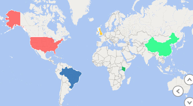
Geographical map visualization - Sales Performance by Region
3.0. Core application of data analytics
3.2. Financial management
Data visualisation and dashboards
Data visualization and dashboards are powerful tools in modern financial management. By transforming complex financial data into clear and interactive visual representations, organizations can make informed decisions, track performance, and drive financial success. These visualizations not only simplify data analysis but also provide a real-time overview of financial health, enabling quicker responses to market changes and strategic planning. In this era of data-driven decision-making, mastering data visualization techniques and designing informative financial dashboards are paramount for any business or financial professional.
Releted Context:
3.2.1. Time value of money analysis for different types of cash flows 3.2.2. Loan amortization schedule 3.2.3. Project evaluation techniques using net present value (NPV), internal rate of return (IRR) -
3.2.4. Carry out sensitivity analysis and scenario analysis in project evaluation -
3.2.5. Data visualisation and dashboards
KEY TAKEAWAYS
- Data visualizations and financial dashboards simplify complex data, empowering quicker and more informed financial decisions.
- Interactive dashboards offer real-time snapshots of financial performance, enabling businesses to respond swiftly to market dynamics.
- Visualizing financial data aids in strategic planning, helping organizations identify trends and opportunities for growth or cost reduction.
- Effective data visualization fosters efficiency in financial reporting and transparency, enhancing communication and accountability within the organization.
Importance of Visualizing Financial Data:
- Visualizing financial data goes beyond just creating appealing charts; it's a strategic necessity.
- It helps in turning raw financial numbers into actionable insights
- Visualizing complex financial concepts such as budget allocation, revenue trends, and cost analysis simplifies the intricate world of numbers. Financial professionals and decision-makers find it easier to grasp the significance of the data when it's presented visually.
Complex Financial Concepts Made Simple:
Data visualization simplifies intricate financial concepts like budget allocation, revenue trends, and cost analysis.
It makes it easier for financial professionals and decision-makers to grasp the significance of the data.
Accelerating Informed Decision-Making
One of the key advantages of data visualization is its power to accelerate decision-making. Interactive dashboards provide real-time insights, enabling financial managers to promptly respond to market shifts and emerging opportunities. The days of sifting through spreadsheets for hours are over. With visualizations, financial reporting becomes more efficient and less time-consuming.
Strategic Planning and Forecasting
Moreover, data visualization is not just about the here and now. It also aids in strategic planning and forecasting. By visualizing historical financial data, organizations can identify trends and patterns that might have otherwise gone unnoticed. Armed with this knowledge, they can chart a course for future financial success.
Enhancing Financial Reporting:
- Data visualizations streamline financial reporting, reducing the time spent on manual data interpretation and presentation.
- This, in turn, improves efficiency in financial management.
Transparency and Accountability
Transparency is another crucial element. Dashboards promote transparency within organizations by making financial data easily accessible and understandable to stakeholders. This transparency fosters accountability and trust, both within the organization and with external partners.
Communication and Collaboration:
- Visual representations of financial data facilitate communication across departments.
- This encourages collaboration between finance, marketing, sales, and other teams.
Customization for Specific Goals:
- Dashboards can be tailored to display metrics and KPIs that are most relevant to an organization's specific financial goals.
- This customization ensures that decision-makers focus on what matters most.
Choosing the Right Technology and Tools
Choosing the right technology and tools is also essential. From Excel to specialized business intelligence platforms, there's a wealth of options. The choice depends on an organization's unique needs and resources.
Example of how data visualization can be applied in financial management:
Scenario:
Imagine you are the CFO (Chief Financial Officer) of a retail company, and you want to assess the performance of your stores in different regions. You have access to a vast amount of financial data, including sales revenue, expenses, and profit margins for each store. Analyzing this data manually through spreadsheets would be time-consuming and may not reveal important trends.
Application of Data Visualization:
You decide to leverage data visualization tools to gain insights quickly and make informed decisions.
- Sales Performance by Region:
- You create a geographical map visualization that color-codes regions based on sales performance.High-performing regions are shown in green, while low-performing regions are in red.
- Prepare Your Data:
Organize your data so that it includes the following columns:- Region names or identifiers.
- Sales performance data (the values that determine the color-coding).
- Geographical data (like country names, state names, or latitude/longitude coordinates) that Excel can use to map the regions.
- Open Excel and load your data into a new or existing worksheet.
- Select Your Data:
- Highlight the data including the region names, sales performance data, and geographical data.
- Insert a 3D Map (Power Map):
- For Excel 2013, go to the "Insert" tab and click on "Map" (if you don't see the "Map" option, you may need to enable the Power Map add-in first).
- For Excel 2016 and later, go to the "Insert" tab and click on "3D Map."
- Configure Your Map:
- A new window will open, and you will see a map. Excel will attempt to detect geographical data in your dataset. You may need to help Excel identify which columns contain the region names and geographical data if it doesn't do it automatically.
- Add Sales Data to the Map:
- In the 3D Map/Power Map window, look for the "Layer" pane on the right side.
- Drag and drop the sales performance data field into the "Height" or "Color" section of the "Layer" pane. You can choose how you want the regions to be colored based on your data.
- Color-Coding:
- Configure the color-coding in the "Layer" pane. For example, you can set up a gradient where high sales are green and low sales are red.
- Customize Your Map:
- You can further customize your map by adjusting settings like the legend, labels, and tooltip information.
- Play and Explore:
- Use the navigation tools and time animations (if applicable) to explore your map visualization.
- This visualization makes it easy to identify which regions are contributing the most to your revenue and which ones need improvement.
 Try creating one keyboard_arrow_up keyboard_arrow_down
Creating a geographical map visualization in Excel to color-code regions based on sales performance can be achieved through several steps. One way to do this is by using Excel's built-in features along with the data visualization capabilities of Power Map (for Excel 2013) or 3D Maps (for Excel 2016 and later), if available. Please note that the specific steps and features may vary slightly depending on your version of Excel. Here's a general guide:
Save Your Map:
Once you're satisfied with your map, you can save it within your Excel workbook. Remember that the specific steps and options may vary depending on your version of Excel and the availability of the Power Map or 3D Maps feature. Ensure you have the necessary add-ins or features enabled if required.
Hide keyboard_arrow_up keyboard_arrow_down
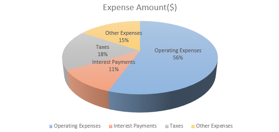
- Expense Breakdown:
- A pie chart is used to visually represent the breakdown of expenses (e.g., rent, salaries, utilities) for each store.
- Prepare Your Data:
- Enter the expense categories and their respective amounts in an Excel spreadsheet.
- Select Data for Chart:
- Highlight the expense categories and their corresponding expense amounts. This is the data you want to use for the pie chart.
- Insert Pie Chart:
- Go to the "Insert" tab in Excel.
- Click on "Pie Chart" and select a 2D or 3D pie chart style, whichever you prefer.
- Create the Chart:
- A pie chart will be inserted into your worksheet. You can customize it as follows:
- To change the chart title, click on the chart title and edit it. You can use a title like "Expense Composition."
- You can also right-click on different elements of the chart (slices, legend, etc.) to format and customize them as needed.
- Legend:
- If a legend isn't automatically added, you can add one by right-clicking on the chart, selecting "Add Chart Element," and choosing "Legend."
- Explode a Slice (Optional):
- If you want to emphasize a particular expense category, you can "explode" or pull out a slice of the pie. Click on the slice you want to explode, and then drag it away from the center of the pie chart.
- Formatting:
- Customize the chart further by right-clicking on various elements, such as labels and the chart area, to change colors, fonts, and other visual aspects.
- Save and Share:
- Save your Excel file with the chart, and you can also copy and paste the chart into other documents or presentations.
- This chart helps you identify cost-saving opportunities and allocate resources more effectively.
 Try creating one keyboard_arrow_up keyboard_arrow_down
Pie Chart for Expense Breakdown
Creating a pie chart to illustrate the composition of a company's expenses is a great way to visualize the percentage breakdown of various expense categories. Here's an example of how to create a pie chart in Excel to represent the composition of a company's expenses:
Assume you have the following expense data:
Expense Category Expense Amount($) Operating Expenses 25,000 Interest Payments 5,000 Taxes 8,000 Other Expenses 7,000
This pie chart effectively illustrates the composition of the company's expenses, showing the percentage breakdown of each expense category relative to the total expenses. Viewers can easily see how expenses are distributed among operating expenses, interest payments, taxes, and other expenses.
Hide keyboard_arrow_up keyboard_arrow_down
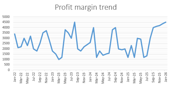
- Profit Margin Trends:
- Line charts are created to show the trends in profit margins over time for each store.
- Enter Your Data:
- Open Excel and enter your data into a new worksheet, with "Month" in column A and "Profit" in column B.
- Select Data Range:
- Click on cell A1 (Month), hold the mouse button, and drag to cell B6 (May) to select the entire data range.
- Insert a Line Chart:
- Go to the "Insert" tab in the Excel ribbon.
- Click on the "Line" chart type (usually found under the "Charts" group). Choose the basic "Line" chart without markers.
- Customize Axis Labels:
- By default, Excel may not correctly interpret the "Month" column as the X-axis. To fix this, right-click on the horizontal axis (the one with the month labels) and choose "Format Axis."
- In the "Axis Options" pane, under "Axis Type," select "Text Axis" to ensure the months are treated as categories.
- Add Chart Title:
- Click on the chart title area (usually at the top of the chart) and type a title, such as "Monthly Profit Trends."
- Customize Data Labels:
- To see the profit values at data points, right-click on one of the data points in the chart.
- Select "Add Data Labels." Profit values will now appear on each data point.
- Customize Gridlines and Other Elements:
- You can further customize the chart by adjusting gridlines, legends, and other elements to enhance readability and clarity.
- Save and Position the Chart:
- Save your Excel file.
- To move the chart to its own worksheet or to another location in the same worksheet, click on the chart, and then click and drag it to the desired location.
- You can quickly spot whether profit margins are improving or declining and take action accordingly.
 Try creating one keyboard_arrow_up keyboard_arrow_down
Line charts - Profit Margin Trends
Your Excel line chart should now display the profit trends over time, with each month represented on the X-axis and the corresponding profit on the Y-axis. This chart provides a visual representation of how profits have changed over the months for the store.
Hide keyboard_arrow_up keyboard_arrow_down
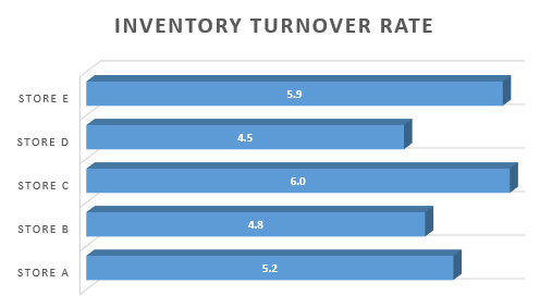
- Inventory Turnover Rate:
- Bar charts are used to compare the inventory turnover rates between stores.
- Prepare Your Data:
- Column A: Store Names
- Column B: Inventory Turnover Rates
- Select Your Data:
- Click and drag to select both columns of data for all the stores.
- Insert a Bar Chart:
- Go to the "Insert" tab in the Excel ribbon.
- Click on the "Bar Chart" icon.
- Choose the "Clustered Bar" chart (or any other bar chart type you prefer). This will insert a blank bar chart into your worksheet.
- Format the Chart:
- Resize and move the chart to your preferred location.
- Add a chart title, axis labels, and a legend for clarity, if needed. Right-click on various chart elements to access formatting options.
- Labeling the Data:
- Ensure that the horizontal axis represents the store names. If not, right-click on the horizontal axis, and select "Format Axis."
- In the "Axis Options" pane, under "Axis Type," select "Text Axis."
- Data Labels:
- To display the actual inventory turnover rates on the bars, click on the bars to select them.
- Right-click and choose "Add Data Labels."
- Customize the Chart:
- Customize the chart further to suit your needs. You can change colors, add gridlines, or adjust the scale of the vertical axis.
- Save and Share:
- Once you're satisfied with the chart, save your Excel file.
- You can then copy and paste the chart into other documents or presentations or share the Excel file directly.
- This visualization helps you identify slow-moving products and optimize inventory management.
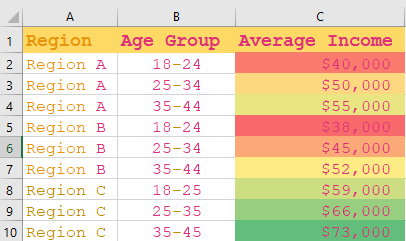
- Customer Demographics:
- A demographic heatmap is created to show the age and income distribution of customers in different regions.
- Prepare Your Data:
- Column A: Regions
- Column B: Age Groups
- Column C: Income Brackets
- Column D: Data Values (e.g., customer counts)
- Select Your Data:
- Click and drag to select the data range that includes all regions, age groups, income brackets, and corresponding data values.
- Insert a Heatmap Chart:
- Go to the "Insert" tab in the Excel ribbon.
- Click on the "Insert Statistic Chart" icon (it looks like a histogram with bars).
- Choose the "Heatmap" chart from the available options.
-
If you don't have a specific heatmap chart option in Excel
➢ If you don't have a specific heatmap chart option in Excel or prefer to create a demographic visualization differently, you can create a customized representation using conditional formatting with colors in a table or pivot table. Here's how you can do it:
- Prepare Your Data:
- Column A: Regions
- Column B: Age Groups
- Column C: Income Brackets
- Column D: Data Values (e.g., customer counts)
- Select Your Data:
- Click and drag to select the data range that includes all regions, age groups, income brackets, and corresponding data values.
- Create a Pivot Table:
- Go to the "Insert" tab in the Excel ribbon.
- Click on "PivotTable" and create a new PivotTable using your data.
- Set Up the Pivot Table:
- Drag "Regions" to the Rows area.
- Drag "Age Groups" to the Columns area.
- Drag "Income Brackets" to the Filters area.
- Drag "Data Values" to the Values area.
- Apply Conditional Formatting:
- Click on the cell within the PivotTable that contains your data.
- Go to the "Home" tab in the Excel ribbon.
- Click on "Conditional Formatting" and choose "Color Scales" or "Heat Maps." Excel will automatically apply colors based on the values.
- Customize the Pivot Table:
- Adjust the PivotTable settings, such as choosing a different color scale or legend, to fit your preferences.
- Save and Share:
- Once you're satisfied with the PivotTable representation, save your Excel file.
- You can then copy and paste the PivotTable into other documents or presentations or share the Excel file directly.
- Prepare Your Data:
- Format the Chart:
- Resize and move the chart to your preferred location.
- Add a chart title and axis labels. Right-click on various chart elements to access formatting options.
- Customize the Chart:
- Customize the color scale to represent the data values effectively. You can choose a predefined color scale or create a custom one.
- Save and Share:
- Once you're satisfied with the chart, save your Excel file.
- You can then copy and paste the chart into other documents or presentations or share the Excel file directly.
- This helps in tailoring marketing strategies to specific customer segments.
- You can quickly identify underperforming regions and take corrective actions.
- It's easier to communicate key financial insights to other stakeholders, such as the CEO or the board of directors.
- Data visualization allows for real-time monitoring of financial metrics, enabling you to respond promptly to changing market conditions.
- It enhances transparency, as everyone in the organization can access and understand the financial data.
 Try creating one keyboard_arrow_up keyboard_arrow_down
Heatmap - Customer Demographics
Hide keyboard_arrow_up keyboard_arrow_down
Benefits:
By using data visualization in this scenario:
Continuous Learning for Adaptation
The world of data visualization is ever-evolving. Continuous learning is essential for financial professionals to stay updated on best practices and emerging trends. In a rapidly changing financial landscape, those who can harness the power of data visualization are better equipped to navigate the complexities effectively.
Conclusion: Empowering Financial Management
In conclusion, data visualization is not just a tool; it's a catalyst for informed decision-making, efficient reporting, strategic planning, and enhanced communication in financial management. It's the bridge between raw financial data and actionable insights, making it an indispensable asset for modern financial professionals and organizations.
Syllabus
-
1.0
Introduction to Excel
- Microsoft excel key features
- Spreadsheet Interface
- Excel Formulas and Functions
- Data Analysis Tools
- keyboard shortcuts in Excel
- Conducting data analysis using data tables, pivot tables and other common functions
- Improving Financial Models with Advanced Formulas and Functions
-
2.0
Introduction to data analytics
-
3.0
Core application of data analytics
- Financial Accounting And Reporting
- Statement of Profit or Loss
- Statement of Financial Position
- Statement of Cash Flows
- Common Size Financial Statement
- Cross-Sectional Analysis
- Trend Analysis
- Analyse financial statements using ratios
- Graphs and Chats
- Prepare forecast financial statements under specified assumptions
- Carry out sensitivity analysis and scenario analysis on the forecast financial statements
- Data visualization and dash boards for reporting
- Financial Management
- Time value of money analysis for different types of cash flows
- Loan amortization schedules
- Project evaluation techniques using net present value - (NPV), internal rate of return (IRR)
- Carry out sensitivity analysis and scenario analysis in project evaluation
- Data visualisation and dashboards in financial management projects
-
4.0
Application of data analytics in specialised areas
- Management accounting
- Estimate cost of products (goods and services) using high-low and regression analysis method
- Estimate price, revenue and profit margins
- Carry out break-even analysis
- Budget preparation and analysis (including variances)
- Carry out sensitivity analysis and scenario analysis and prepare flexible budgets
- Auditing
- Analysis of trends in key financial statements components
- Carry out 3-way order matching
- Fraud detection
- Test controls (specifically segregation of duties) by identifying combinations of users involved in processing transactions
- Carry out audit sampling from large data set
- Model review and validation issues
- Taxation and public financial management
- Compute tax payable for individuals and companies
- Prepare wear and tear deduction schedules
- Analyse public sector financial statements using analytical tools
- Budget preparation and analysis (including variances)
- Analysis of both public debt and revenue in both county and national government
- Data visualisation and reporting in the public sector
-
5.0
Emerging issues in data analytics
 Try creating one keyboard_arrow_up keyboard_arrow_down
Bar charts - Inventory Turnover Rate
Your Excel line chart should now display the profit trends over time, with each month represented on the X-axis and the corresponding profit on the Y-axis. This chart provides a visual representation of how profits have changed over the months for the store.
Hide keyboard_arrow_up keyboard_arrow_down
Financial management
Table of contents
Business Data Analytics - Past Papers


